
Systematic Design for Senior Living
Context Setting
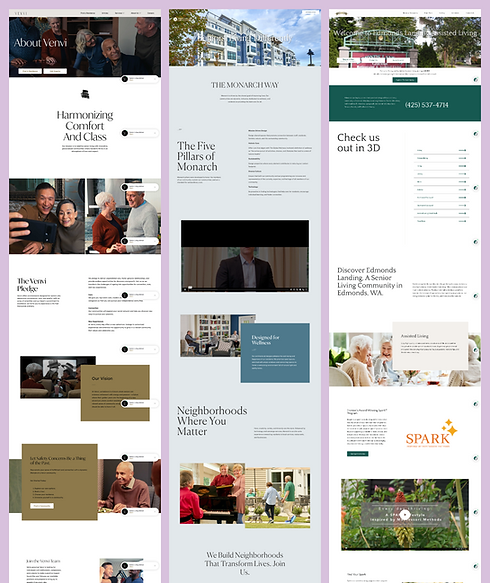
WellTower, a real estate investment trust, needed to simplify the management of websites across their senior living community portfolio.
Rather than each operator creating and running their own website, they wanted a scalable design system: a flexible, component-based structure that could power lots of different sites while keeping things consistent, efficient, and easy to manage.
When I joined the team as the UX/UI Lead, following the launch of the first operator site in the new system, I quickly noticed a few big hurdles:
01
Too many customizations
Every operator wanted their site to look unique, which made building a shared system tricky.
02
An overwhelmed content team
Without clear design support, they were cobbling together pages from mismatched components.
03
A disconnect between design & dev
Without regular syncs, they ended up with beautiful mockups that didn't fit the constraints or a final product that didn't match the designs.
TL;DR
As UX/UI Lead, I:
-
built a flexible component library to provide limits but also space for customization.
-
led a small design team to create site wireframes using the component library to make things easier for the content team.
-
aligned design and development through regular collaboration and worked closely with the clients to make sure we were all on the same page throughout.
By streamlining the process and balancing structure with creativity, we delivered a cleaner, more consistent product that made clients happier, reduced build stress, and made future site launches faster and easier.
The experience taught me the importance of anticipating downstream impact and thinking more systemically from the start.
Exploration
Jumping in to take over an ongoing project meant that the first operator site I worked on was also my opportunity to explore solutions.
I led the design team in using existing components as much as I could while introducing new ones to meet design goals.
The results looked great, but we unknowingly made many changes that added complexity for developers and slowed things down.

Design & Refine
To bring more structure (and sanity) to the design process, I did the following:
Built out a clean, reusable Component Library in Figma, using auto-layouts, component variants, and clear naming conventions
Started weekly check-ins with stakeholders and devs to stay aligned, share updates, and flag risks early.
Worked closely with engineers to simplify component patterns so they were easier to build but still flexible for different operator needs.
Iterate & Validate
With the system in place, we kept improving:
1
I worked with the development team to find smart ways to bake in variety. For example (see below), cards could optionally show titles, subtitles, overlines, paragraph text, and CTA buttons. Using these options and new colors & fonts gave each operator’s site a distinct feel without overcomplicating the code.
2
I found more areas to increase design flexibility, like adding background color options to a variety of components, without overly increasing code complexity. This took a lot of back and forth with the development team, but was worth the effort!
3
I worked with the project management team to move design reviews earlier, giving feedback on components as they were built so fewer surprises popped up later on.


Build
This project was an ongoing cycle of iteration and building as we brought on new operator sites. As each site moved into production, there were some contants.
-
I partnered closely with developers to adapt & translate designs into real components within their constraints.
-
I led design QA across all pages, making sure the details matched the vision.
-
I supported the content team with guidance on using components properly, helping them avoid issues like skewed images or misaligned content.
Results
By the end of the project, we had a well-oiled system that could launch new operator sites more easily, with less stress and better results.
Results
Cleaner sites, happier clients, fewer launch-day hiccups, and smoother onboarding for the next wave of sites.
What I learned
-
Involving developers early saves time and headaches.
-
Clear systems empower teams and free up time for the fun stuff.
-
You can build for scale and support creativity, it just takes the right balance of structure and flexibility.
This project really reinforced my love for system thinking, cross-functional teamwork, and the kind of behind-the-scenes problem-solving that makes everything run more smoothly, for teams and for users.